Indiana Trust Wealth Management
Investment Advisory Services
by Clayton T. Bill, CFA
Vice President, Director of Investment Advisory Services
- The U.S. equity market, represented by the S&P 500 index, rose 3% for the week.
- The stock market’s P/E ratio is elevated relative to recent history. How well does the P/E ratio predict future returns?
The US stock market’s price-to-earnings (P/E) ratio, defined as the price per share of all the stocks in the S&P 500 index divided by next year’s expected earnings per share, is elevated relative to history. It stands at 21x (“21 times”) next year’s earnings. The average P/E over the last thirty years is 17x.
Just because the market is “expensive” relative to its historic average does not mean that it will become “cheap” in the next month or two. The market’s P/E ratio does a poor job of explaining short-term stock market returns.
However, it is frequently posited that, despite the lack of predictive power for the near-term, the P/E ratio does a good job of foreshadowing long-term returns. The relationship is often described as follows: when the P/E ratio is low (and the market is “cheap”), future long-term returns will be good. When the P/E is high (market is “expensive”), returns will be low.
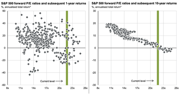
JP Morgan Asset Management publishes the below chart every quarter. It is a side-by-side analysis of the S&P 500’s P/E ratio and future 1-year returns (left side) and 10-year returns (right side). It also includes a green bar showing the current P/E level:

Source: JP Morgan Asset Management, 12/31/24
The P/E ratio appears to have a tight relationship with subsequent 10-year returns – much more so than 1-year returns, which looks like a random scatterplot. At its current P/E level, the chart on the right portrays a near certainty for low returns over the next ten years.
There is a hidden, serious problem with this analysis. The dots on the charts represent historical return windows starting 24 years ago, rolled forward monthly. So, each dot of rolling 10-year periods shown above has 9 years and 11 months of overlapping return data. The dots are not independent.
In statistics, this problem is referred to as serial correlation. Presenting the analysis in this manner overestimates the predictive power of the P/E ratio on 10-year returns. (This could be why the charts do not explicitly show a regression line or any of the statistics that normally are published with a regression analysis, such as the r-squared – although the charts give the strong impression that we are looking at a regression.)
Valuations do matter. There is a relationship between high valuations and future long-term returns. However, this chart – which provides the illusion of a mechanical relationship – is not empirical proof of it. Unfortunately, there is no purely quantitative solution for predicting future long-term equity returns. Along with valuations, fundamentals such as corporate profits and profit margins as well as macroeconomic shocks (positive or negative) matter greatly. Those factors are… challenging to model with a regression.
__________
IMPORTANT DISCLOSURES: All info contained herein is solely for general informational purposes. It does not take into account all the circumstances of each investor and is not to be construed as legal, accounting, investment, or other professional advice. The author(s) and publisher, accordingly, assume no liability whatsoever in connection with the use of this material or action taken in reliance thereon. All reasonable efforts have been made to ensure this material is correct at the time of publication.
Copyright Indiana Trust Wealth Management 2025.
